To_Kiss_A_Frog, very beautiful pieces you have there! The "Destiny Intervenes" as well as Katherine's trapeze photoshoot are stunning. The littered photos throughout the first one give it a very distinct tone of forboding while the second's subdued hues give it a somewhat melacholy feel.
In the "Alluring" one though, I don't believe the font nor its color fits the piece all too well. I'd say keeping it to a more neutral color would have been more well-suited. Also, be careful of over-filtering, especially with the blur effects.
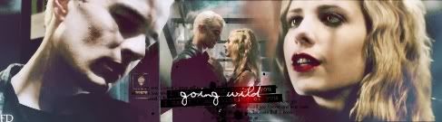
 maxandlizbeliever
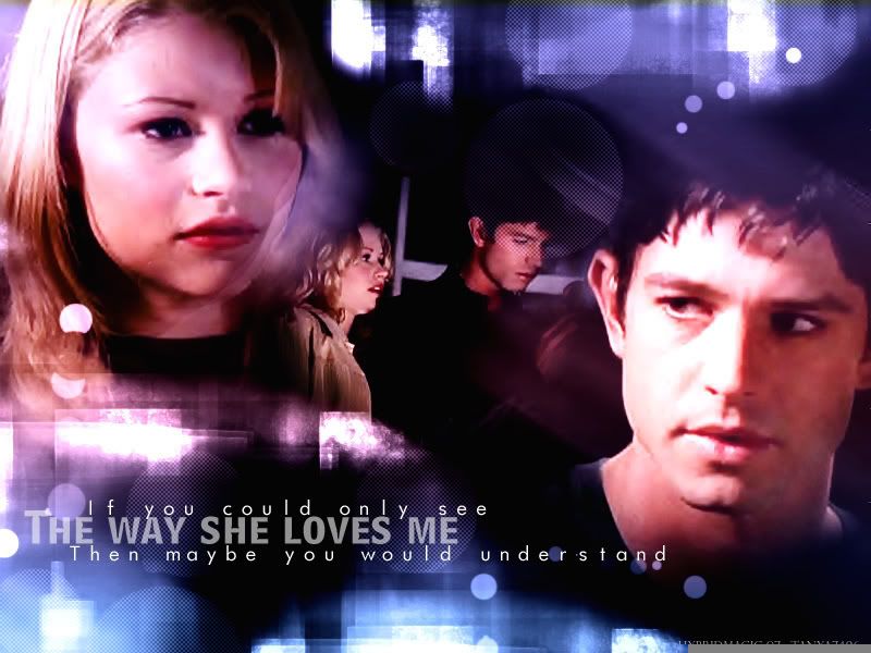
, as per usual your WPs are incredible! The blending in the first is impeccable and the images are so clear, even with the texturization. It's very simple and I love how well it blends into the black background.
On the second one, the coloring is very subtle, and I love how the image looks like it could be a postcard.
And the last one is probably my
absolute favorite, as I have been really getting into the B&W effect lately. In particular, the textures and brushes behind and left to her face is very well-placed and the empty space does not distract or take anything away from the image. Though, I think Liz's face would have suited fine without the filters, possibly even just the smart blur would have sufficed.
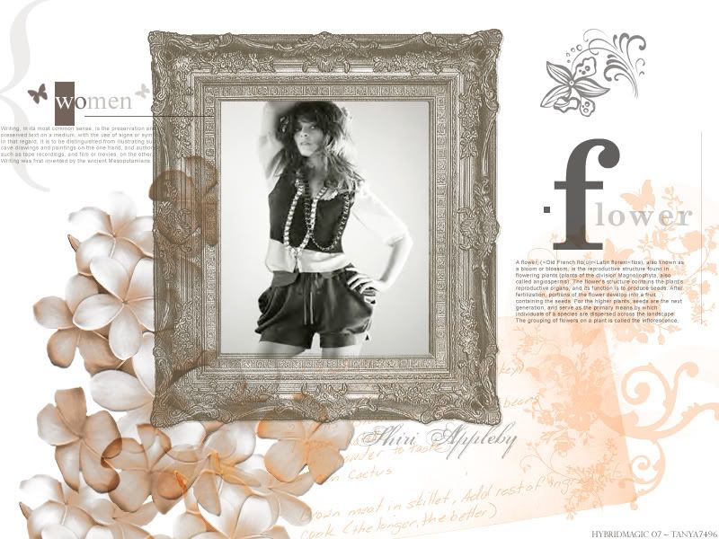
Tanya7496, those pieces are very beautiful, and the photograph frame in the first two makes me squee (I love frames). The colorings fits all the arts very well, and I especially love the speckled lighting in the last one, definitely my favorite one.
I do have one piece of concrit, when using frames, be careful of brushes overlapping into it. Particularly in the second, it distracts from the Shiri and the antique-like frame enclosing her.
Loxyanissa14, good job, especially on the first one! Also, on your "Martyr Tess" piece, I love the images you used. I'm surprised I haven't seen banner or WP with those images yet, with how well they go together and all. Again, great job!
Whew, what a mouthful!
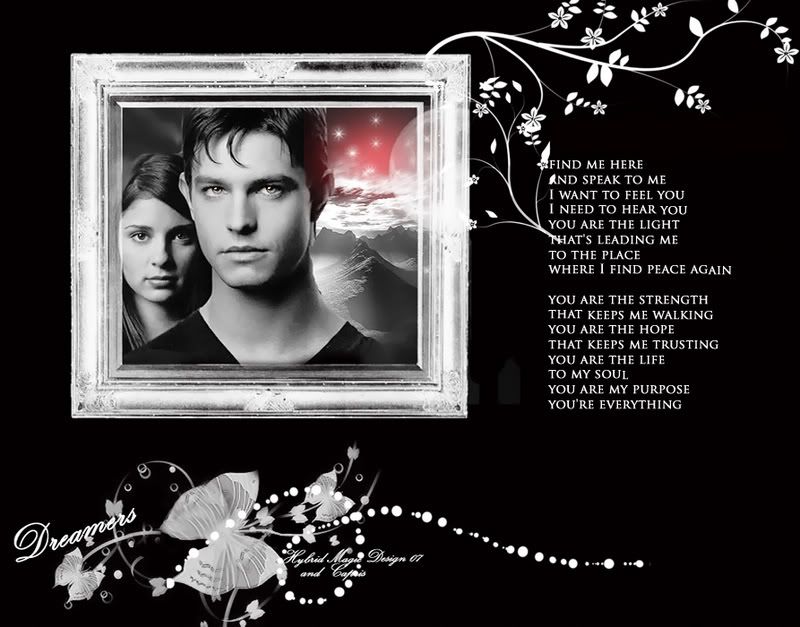
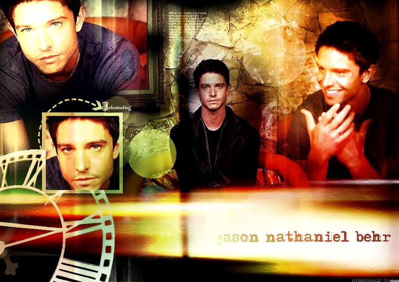
Anyway, I have come bearing a gift. I haven't done much fan art, but I'm trying to get back into the groove of things. So here's a WP I made yesterday:
1024x768 WP
 Images: Emilie-Online.net, hires_hotties@LJ
Textures: Tre-xture, the former peoplemachines@LJ, gender@LJ now choirgirl.org
Brushes: Annika Von Holdt, Unknown Stardust Brush
Lyrics: Angels, Within Temptation
You took my heart, deceived me right from the start.
You showed me dreams. I wish they'd turn into real.
You broke the promise, and made me realize:
It was all just a lie.